
APRIL 1, 2021
Objectway As You’ve Never Seen it: A Tale of a Rebranding
Head of Group Marketing
Reading time: 2 min
OWINTALK | BEHIND BUSINESS, BEYOND NEWS
First and most remarkable step Objectway took to redefine its core brand idea is towards the implementation of a new design system, meaning a branding strategy that polishes our vision – already shifted to a client-centric approach in 2016 – and gives consistency to the overall visual universe of the brand.
We pursue a different, fresher and original style; starting from the website to the product offering, the whole Objectway’s image experiences a radical metamorphosis.
Contents, videos, tone of voice, descriptions, everything is remodelled to introduce not just a new sentiment risen above our brand – as it happened in the past – but a new consciousness pictured inside of it.
Objectway: in our own words
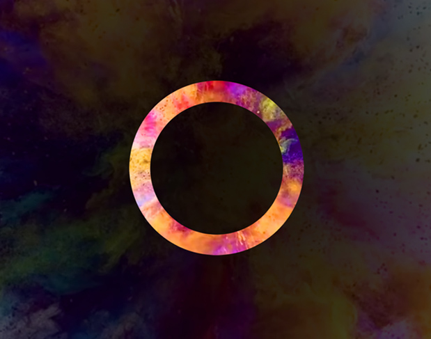
We embrace a new vision. In our perspective the image of the door – featured a bit everywhere in our network – represents a lens that makes it possible to develop a new vision of the reality we are looking at. It is this orientation that leads the tale of the door to guide every action the design system intends to implement in the different areas. It is applied to the webinars because they are thought as the principal source of communication and sharing, so it is advisable to see them as doors that allow the client to increase their own knowledge, focus on a new point of view towards products and market’s trends. It is applied to spot videos, viewed as figurative portals that grant to look beyond the business and finally in it and last but not least in the corporate website, where the circle is used to explain product suites of the two target markets, Wealth and Asset Management.
Simplicity is one of the leading principals of the new design system, characterised by few elements, whose intent is to convey clarity and to emphasise the relevance of the content. Result is that social posts and presentations are simplified through graphics and images that play a role in making reading more fluent and clearer.
Energy is then a component you can encounter through the entire communication strategy we carry out. Have you already visited our website? Have you already seen our contents on social media? Then check them out, you’ll be invested by colours: gradients, colour shades, splashes of colours. The gradient strategy – that you could easily find in our logo even before – is revived in different fields: on the website to identify the areas our company operates in; on social post, where every gradient is linked to a specific content category and much more.
Human is certainly the keystone, the attribute we cannot do without. In fact, what we have said up until now is the background of a pre-existing emergency, made even more crucial due to the historical period firms operate in. We are talking about the need to make your brand more human. This necessity is translated in our strategy particularly on social posts and corporate videos or more widely in a renewed perspective towards content marketing on digital channels.
This way Objectway’s new design system not only characterises the brand with a series of unrealised energic and human adjectives, but also makes sure that whoever approaches its content, be it the website, an image, a video etc. could not doubt on the provenance of the content itself.
Our aim was to tell a story about a digital journey through our brand.
So we’ll go stepwise.
Stay tuned. There’s a lot more to come